Posts by Tomas

Label Orientation and Winding: How They Impact Automatic Labeling Efficiency
Quick Response
How do label orientation and winding direction affect the efficiency of my automatic labeling line?
Incorr...

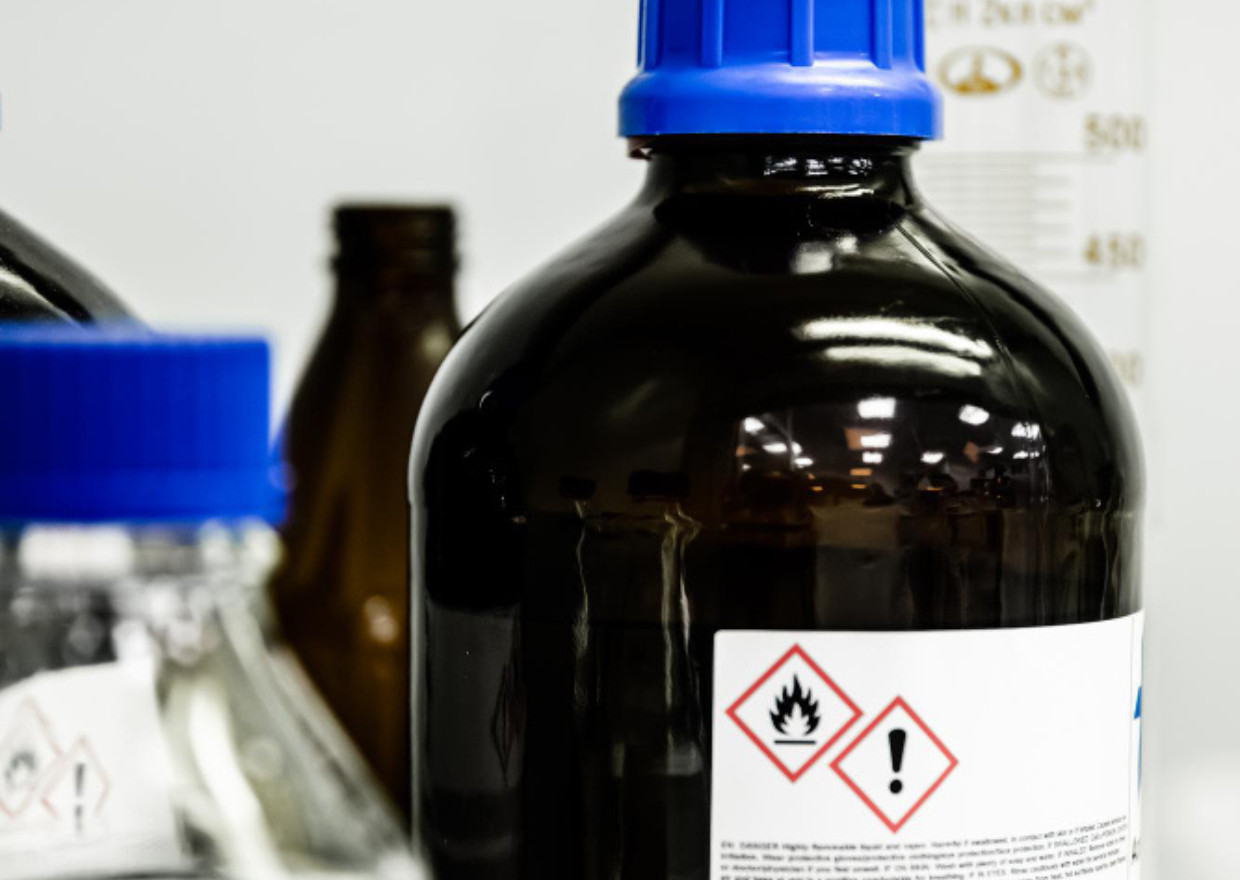
Compliance Labeling: How to Reduce Regulatory Risk in Chemical and Pharmaceutical Industries
Quick Response
How can I reduce regulatory risk in chemical and pharmaceutical labeling without slowing down operations?
...

Tamper Evident Labeling: Advanced Brand Protection for Industrial Markets
Quick Response
How can I protect my products from tampering and ensure brand integrity in industrial markets?
Tamper-evid...

Variable Data Printing (VDP) for Traceability in Complex Supply Chains
Quick Response
How can I improve traceability across my supply chain using variable data printing (VDP)?
Variable Data Pr...
Key Tips for Chemical Product Labeling
Quick Response
¿What should I consider to meet chemical labeling regulations without making costly mistakes?
Chemical lab...

Why the Real Cost of a Label Is Not in the Price Per Thousand
Quick Response
¿Is the cheapest price per thousand labels really the best deal for my business?
Not necessarily. The real...

Signs Your Label Supplier Can’t Scale With Your Business
Quick Response
¿How can I tell if my label supplier can’t scale with my business growth?
If your supplier struggles with ...

How Large Manufacturers Are Consolidating Label Suppliers to Move Faster
Quick Response
¿How can consolidating label suppliers help manufacturers move faster and improve efficiency?
Consolidatin...